The problem
Products we had built picked their own colors, type sizes and spacing. Small differences piled up, and a brand change meant editing each product by hand.
What we built
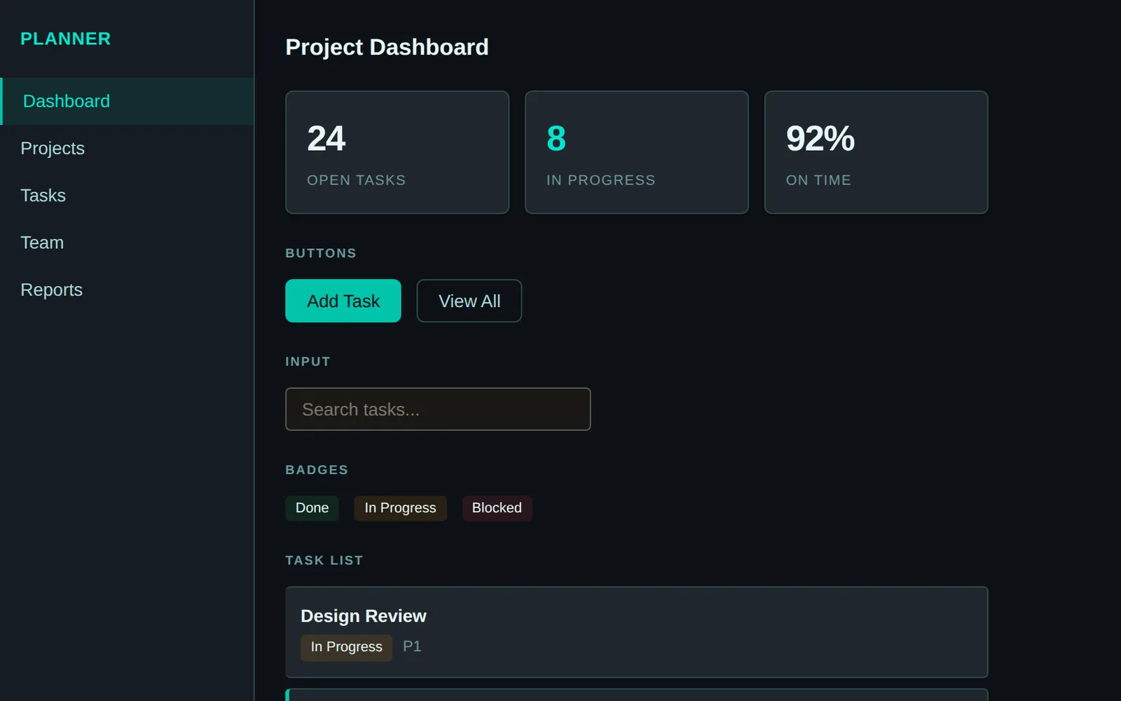
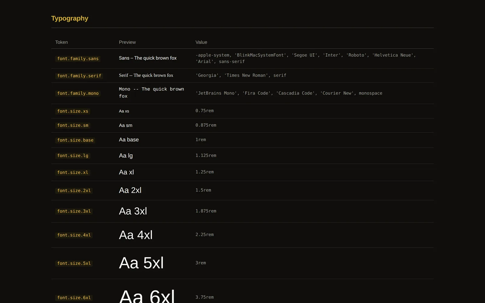
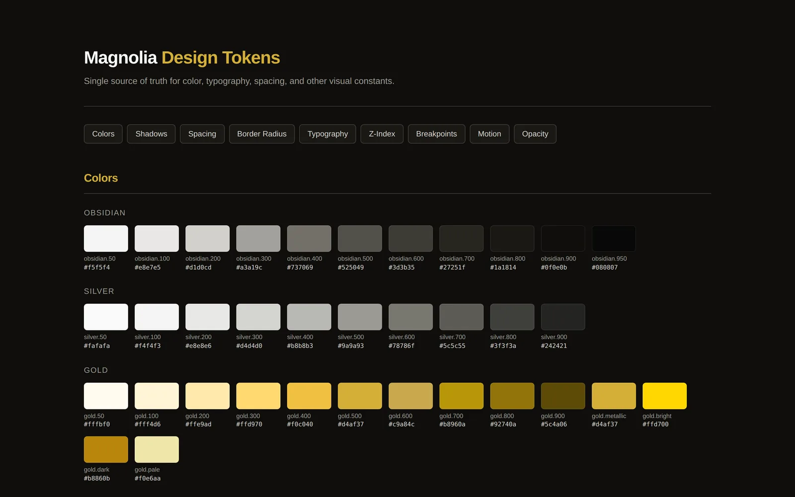
A design system: color, type, spacing, radius, shadow and motion values defined once and published as CSS custom properties. Themes are thin layers over those values, so a dark dashboard and a light marketing page share the same scale. Components are documented in Storybook with their states.
What changed
Products pull the same values instead of copying them. A new theme is a short file, not a rewrite, and the reference pages show the shared values and components in one place.